By Shea Lutton and Eric Harper
Last week, Eric Harper and I laid out how LLMs are accelerating our work as product managers. It is now possible for PMs to validate feature needs with more clarity and speed because LLMs can build actual working prototypes from their product requirement documents. Taking this extra step means PMs can go further to validate the potential of new features with their customers to qualify the sales potential before developer time is used.
LLMs like ChatGPT make PMs directly more productive, reduce development team work by eliminating prototype tasks, generate validated feature backlogs, and deliver more clarity to developers on what needs to be built. A prototype is worth 1000 meetings.
In this post, Eric and I will show screenshots of the tools we use and the steps we take in our process. We’ll lay out the tools, structures, and skills necessary for PMs to start using these new methods. In our example feature, we’ll show how Eric used this process to build an actual feature for his AI-powered legal billing business, Serva Tempus. It highlights how PMs can be more entrepreneurial and iterate faster to find product-market fit.
Diving in
What is the process we use, what are the tools we use for each step, and what skills are required?
| Phase | Tools | Skills |
| 1. Context Library | Git, RepoPrompt, text editors, Cursor | Writing business and technical prompts |
| 2. Feature Planning | DrawCast, ChatGPT O3, Linear | Whiteboarding, organization, markdown review, ticket review |
| 3. Code Execution / Iteration | Cursor, Codex, GitHub, RepoPrompt | Code reviews, git workflows, environment setup, |
| 4. Hosting/Validation | AWS or local hosting | Web server execution, containers |
This process starts with a prompt library. The context of your business should be shared (via git) across all PM and engineering teams so as prompts are refined, the whole firm works with the same background and themes. The prompt library should include materials from across your business, laying out what your core products do for customers, your business strategy, brand style guidelines, UX/UI principles, engineering principles, security principles, and customer roles and personas. See our sample library here.
With the right background context established, then we plan out our feature prototype. We spend as much time planning what we’re going to build as we do working on actual code which avoids endless iteration loops.

The initial prompt is created with RepoPrompt and includes a map of the files in the application, the contents of key files like the database schema and core routines, the architect role from our prompt library, and our instructions to the LLM. The file map and file contents give context on how the existing app works now, before we expand the new feature. Our architect role is focused on the process we want to follow, not on code or infrastructure:
The architect role in Cursor:

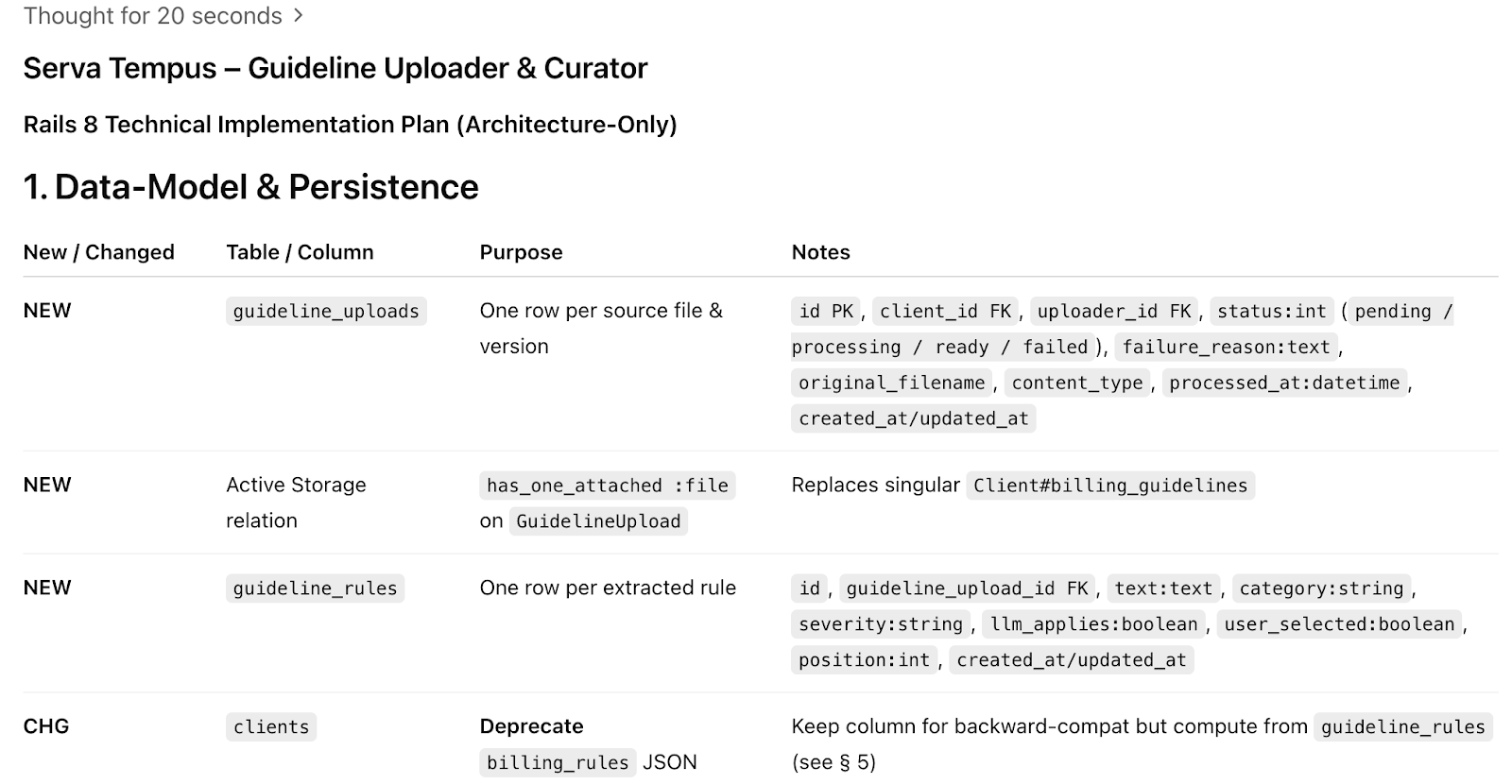
In this initial step, we are trying to create a single markdown file that serves as the equivalent of a technical implementation plan. The output markdown includes sections for business goals, key benefits, scope and requirements, success criteria, deployment plan, and go-to-market details. All the elements of a classic requirements document. This markdown gets a thorough read-through and edit using our brains to make sure it’s correct. Don’t skimp on review time.
A portion of the planning markdown:
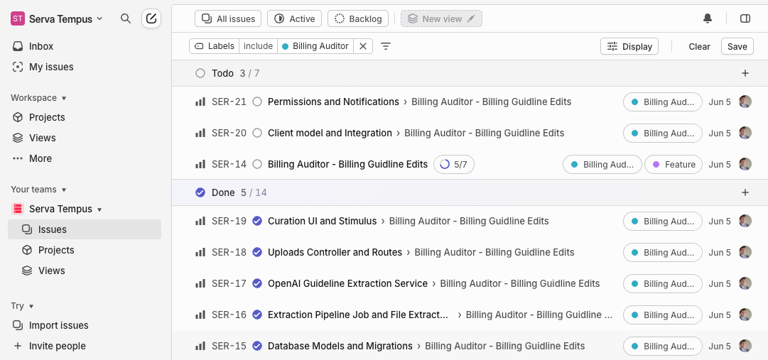
From a high-level markdown, we prompt ChatGPT with our architect role to develop Linear tickets for each major step in the process. Why create Linear (or Jira) tickets? It might feel like an outdated process which can be replaced by AI, but through trial and error we found that planning out each major step helps LLMs to deliver more accurate technical implementations.
For PMs working with a larger team, having a ticket structure gives clarity to the project and allows for parallelization of work to human and AI agents. The first tickets should be the data model changes and for these changes that need to be atomic, like database schema changes, we do not parallelize tasks.
There are quirks that take some experimentation to figure out. On this day it took a few asks before ChatGPT output a single markdown file for us (instead of small fragments) and we had to tweak the prompt by removing the references to the Linear ticket and specifying (repeatedly) that the output should be a single markdown block.
It is helpful to add negative feedback to your prompt library during your revisions. For a separate project to develop a simple marketing website Eric instructed to not add a honeypot or a rails app framework. These negative prompts set your business context for how you work, specifically the things your company does not do, like using certain technologies, process steps, or concepts.
Planning Acceleration
In the remote-work era, whiteboards are not used as much as they used to be. Eric and I both feel that the ability to draw out concepts, UX/UI elements, lists and tasks, and data flows on a whiteboard is a powerful tool to organize our thinking. Since LLMs can work with diagrams and convert handwriting into text, Eric is developing DrawCastAI (coming soon) so a phone camera can take continuous snapshots of a whiteboard and integrate the images directly into your LLM workflows. We both keep a whiteboard by our desks to convert brainstorming into requirements and actions and keep us in flow-mode for longer periods.
Diagrams accelerate planning work. To illustrate a three AZ layout for high availability infrastructure in AWS, I was able to draw the picture below and have it be turned into a CloudFormation template.
AWS “nested boxes” architecture diagram:
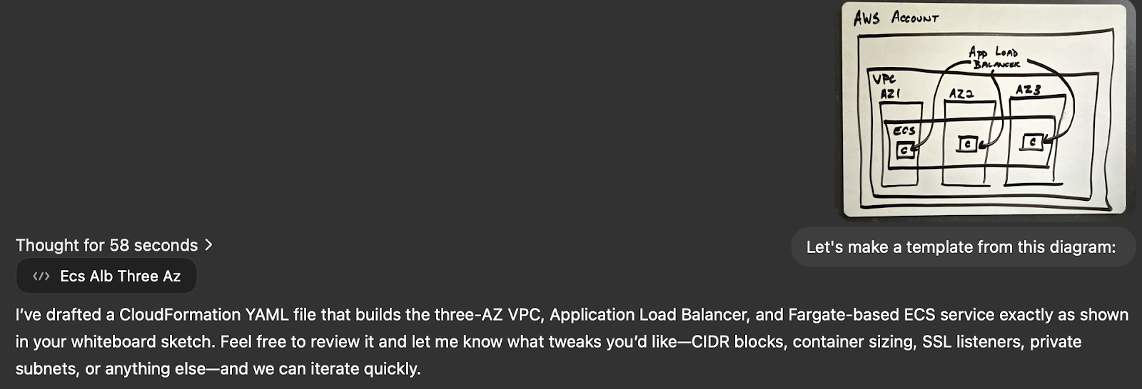
For this application example, I needed a highly-available AWS ECS Fargate environment in three availability zones, auto-scaling up and down as needed. From the initial diagram, I got the right basic structure, but the template was missing the many standards I expect in a secured AWS account. I incorporate the aws.md file from our prompt library to revise the CloudFormation by reducing the IPv4 CIDR blocks, adding encryption, and specifying private subnets.

This process of iterating on the CFN templates took less than 15 minutes, from drawing the original whiteboard sketch to the revised template with our environment standards. Writing out your standard patterns with your enterprise architects and engineering managers allows all the templates to be consistent with your security and architecture principles.
Code Execution
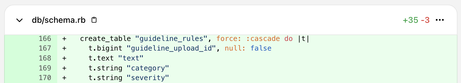
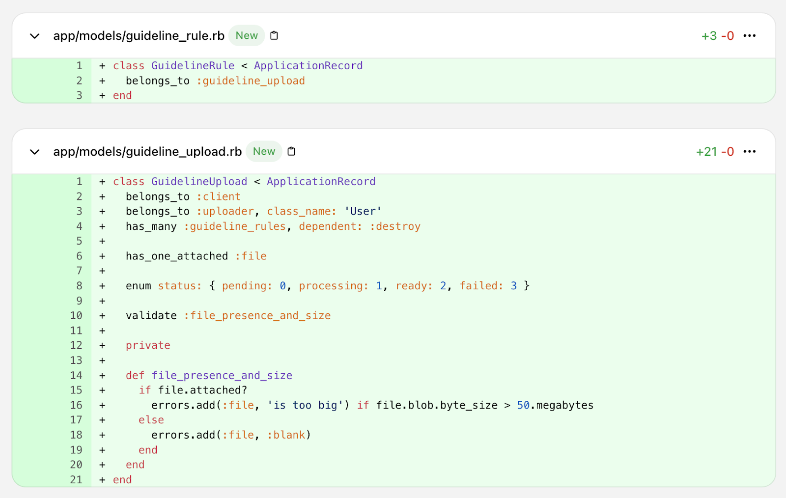
With a solid plan and specific Linear tickets, it’s time to start generating code using OpenAI’s Codex to iterate on the code base. The first Linear ticket becomes the prompt to create the database tables and column changes. The work to this point has created a strong plan and atomic steps for updating the data model, creating the specific data extraction features needed, creating the UI, and maintaining the right permissions.
Initial data model execution prompt in Cursor

Like Kenton V’s recent article on creating an OAuth library, the code produced can be amazingly accurate. In this case, the first commit (reviewed, not vibed) led to a working set of changes to the data model.
Max Mitchell wrote an interesting blog post that prompts should be considered part of your source code. Since models are adding new capabilities so quickly, it will likely be just as important to save the prompt that led to the feature as the feature code itself. Certainly for PMs creating prototypes, developers who eventually turn the feature into a hardened, reliable production release will appreciate the background from those prompts.
Costs
The costs for these tools add up for individuals, but for Eric and me they are clearly worth the money. We pay:
| ChatGPT Pro | Cursor | DrawCast | RepoPrompt | Claude | Total |
| $200/month | $20/month | TBD | $15/month | $20/month | ~$255/month |
If you’re a solo entrepreneur or product owner, think of this as time and money you’re not paying your outsourced development teams. It takes some practice and repetition to learn and get fast with, but the learning curve is not that steep. If you run a large team of product managers, tool costs can add up. The way to think about this is not the cost for PMs, but the savings in development effort. It keeps developers out of meetings and focused on core platform features. And it can give you the opportunity to upskill or refocus your team and to move faster with less development effort.
Here is a great article breaking down the costs. If your company will not pay for these tools, you need to raise the alarm that your skills are being left behind (and that your company is NGMI). Or simply pay for them yourself to keep yourself relevant. This is the fastest moving wave I’ve seen in my tech career and the value is obvious to those who spend a few weeks learning some new tricks.
Skills to Build
If you’re a non-technical PM, you can start to build your skills with tools like Lovable or Replit. They are not as custom, and in my experience Replit can be somewhat obstinate in revising elements in a prototype or interface, but it is nearly instantaneous, easy, and can give customers an impression of the feature you’re exploring. Your prompt library and context are still relevant and work with these tools too.
If you’re semi-technical, this is the time to focus on your tech skills. Getting technically deep is valuable and the opportunity to master git workflows, set up your own CI/CD pipelines, and produce your own prototypes will give you more influence. The more you can validate ideas and act as an entrepreneurial agent, the more success you will have.